2012/09/07 – 2012/09/09 Shanghai Exhibition Centre
SH Contemporary 2012 made a quite well rounded impression on me, by Chinese standards, which means there were some glitches. By that I mean that it was more interesting than an average visit to Moganshanlu 50. I saw some good art and some bad art, but that can be expected at a fair.
Some individual works that stayed in my mind and camera:
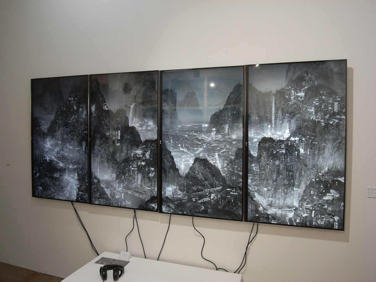
Yang Yongliang’s (杨泳梁) impressive HD-triptych depicting a landscape that reminded of a traditional Chinese ink painting with mountains, but at close look revealed itself as a very detailed video composition of thousands of high-rise buildings and urban elements at night. I guess this is how Shanghai would look like if it was Hong Kong…
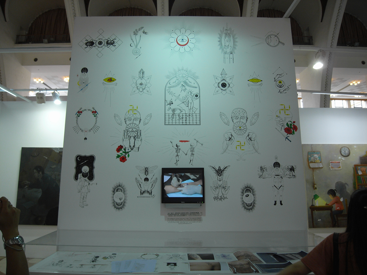
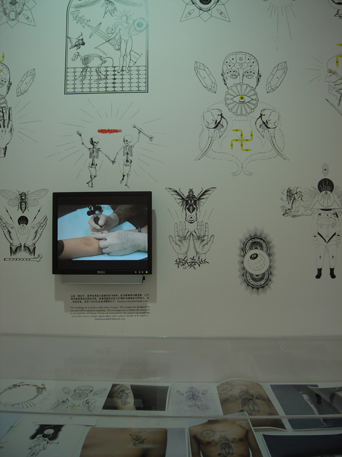
Chen Tianzuo’s (陈天灼) tattoo project. I found the drawings interesting, and he was offering his drawings as tattoo patterns to anyone interested to carry them on their body.
 Luc Schuiten’s water color painting of ‘future Shanghai’. It caught my attention because the idea seemed so simple and outdated. It made me confused about the time. Was this painted thirty years ago, depicting Shanghai today? Or was it painted today, depicting Shanghai thirty years later? The timelines just did not seem to fit. Retro-futurism at work.

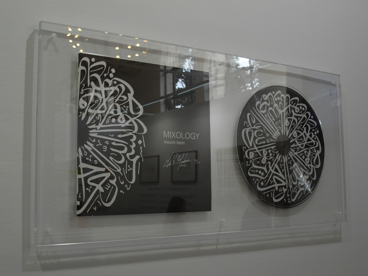
Mounir Fatmi’s ‘Mixology’ record looked interesting at first sight and made me wonder what their content was. But then I found out, that they actually do not have any specific musical content, and that it is rather a prop for a performance. That made me a bit disappointed, but still, the record and cover looked beautiful.
 A creative agency (greenhousecore) was trying to get some attention by showing some body painting, and as you see, it worked and I pressed the shutter.
 The gold-plated insects combined with manga figures using Buddhist symbology of Taiwanese artist Yang Mao-Lin (杨茂林) were an eye catcher as well:
 There were also three quasi-curated exhibitions within the fair – one focused on ink- and ink-inspired artworks, another one on ‘special projects’ and the third one on ‘first appearances’. The ink-section was well-balanced between different media and approaches, and I found it informative, in terms of showing some trends as well. What caught my eye here:
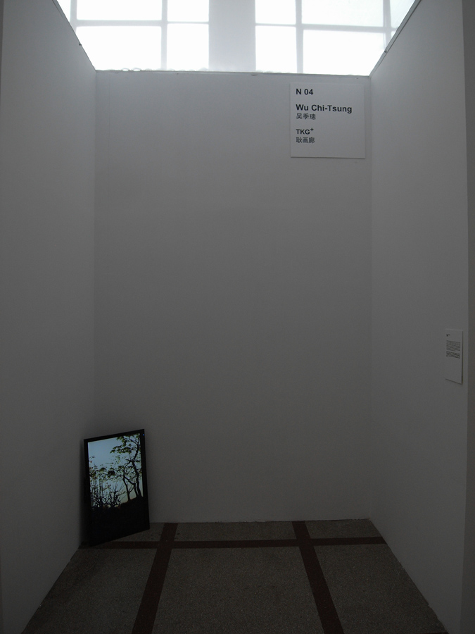
I have seen documentations of Wu Chi-Tsung’s (吴季璁) animated landscapes previously, but this time there was one to see ‘live’. Unfortunately the impression was so-so, the image was a bit pixilated and the animation movement not completely smooth. I guess the gallery/installation team is to blame…
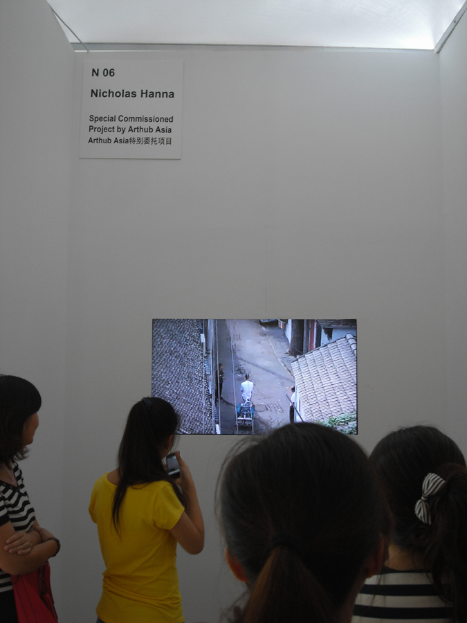
Nicolas Hanna’s project of an automated water-calligraphy tricycle falls into the broad category of geek projects, but it was entertaining:
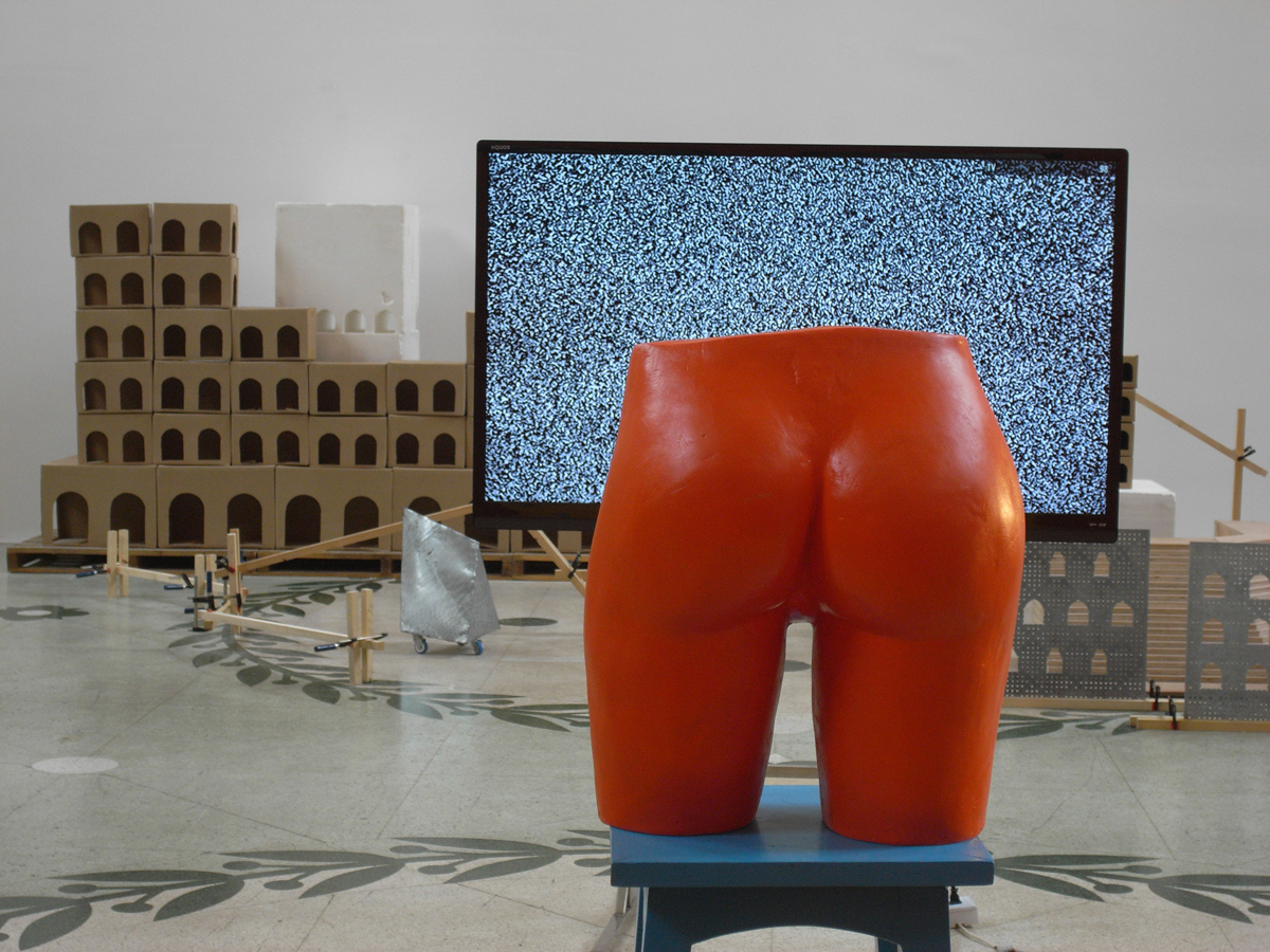
 The special project section was a bit disappointing and I could not make much out of it. For example Chen Zhou’s (陈轴) installation included a large LCD showing an empty channel with black and white ‘snowflakes’ and I doubt that this was by intention:
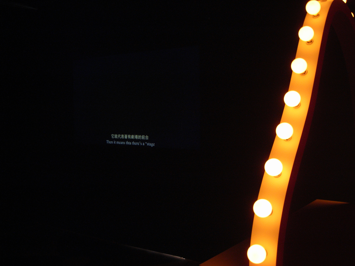
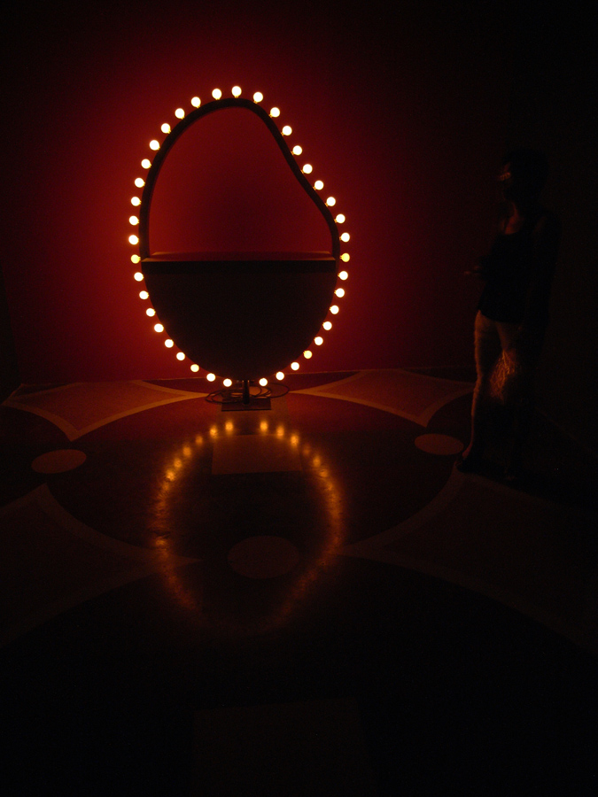
 The first appearance section was on the other hand pretty good, showing interesting and powerful works. The one with the overall best installation was Yu Cheng-ta’s (余政達) work: A really black black-box, and appropriate light ambience, especially given the tricky combination of a projection and a self-illuminated sculpture.
 Sadly Yu Cheng-ta’s installation was rather an exception, and the common denominators for all three sections were badly made installations. I suspect that each gallery was responsible for installing their own work, and this was visible on the results. This problem culminated in the complete failure of the video screening room, where the workers obviously forgot to put in a roof, but no-one really cared. The image was barely visible. This is the booth from outside:
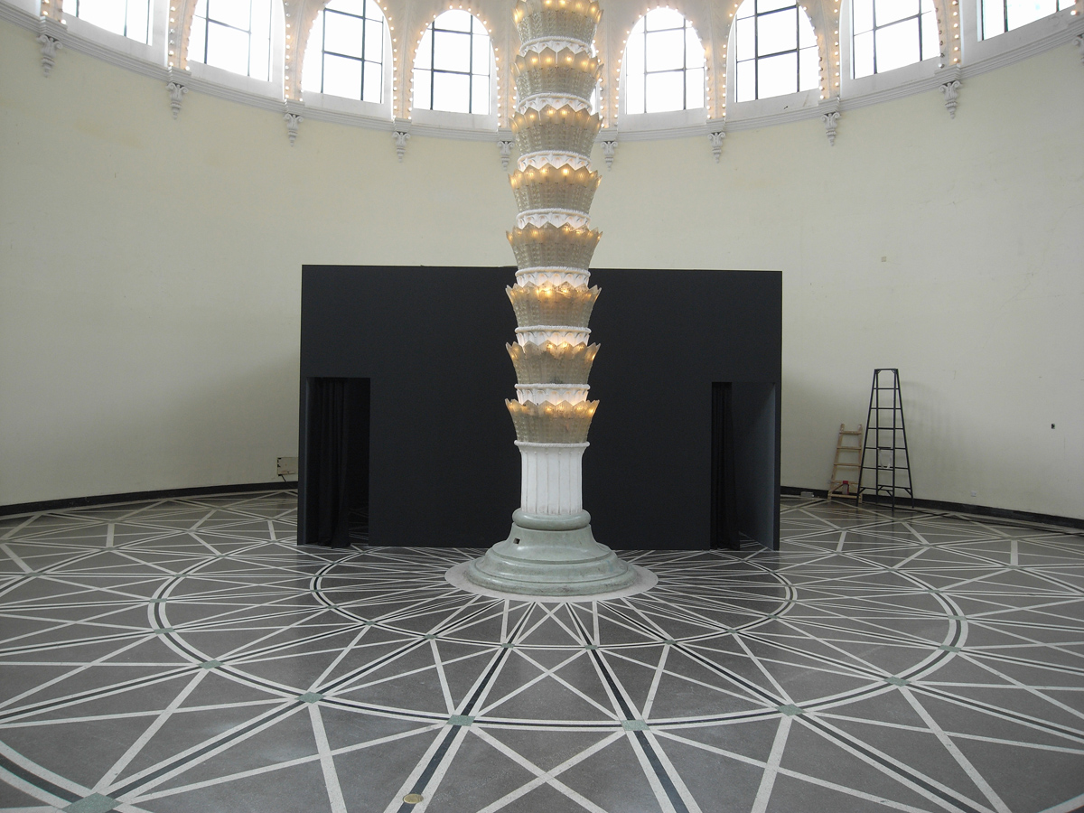
And here it is from the inside. The only thing the video screening box was good for was for Chinese ladies chatting:
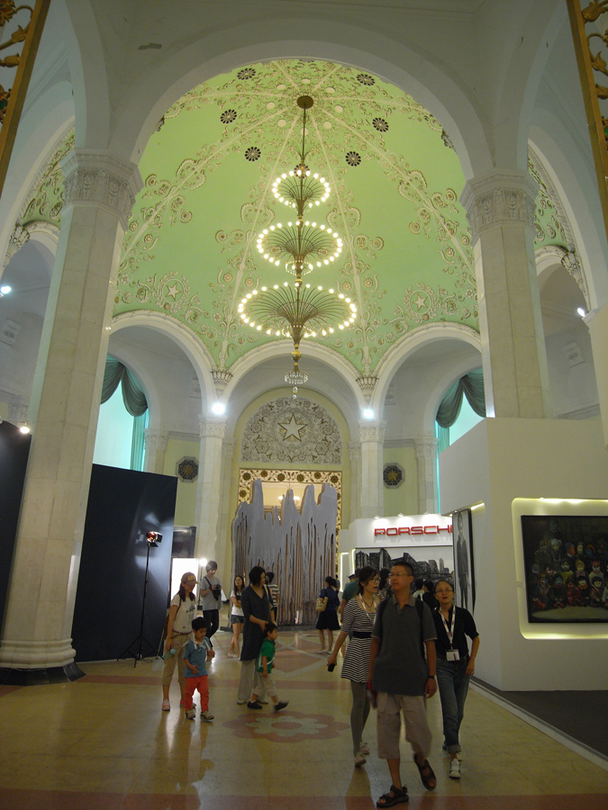
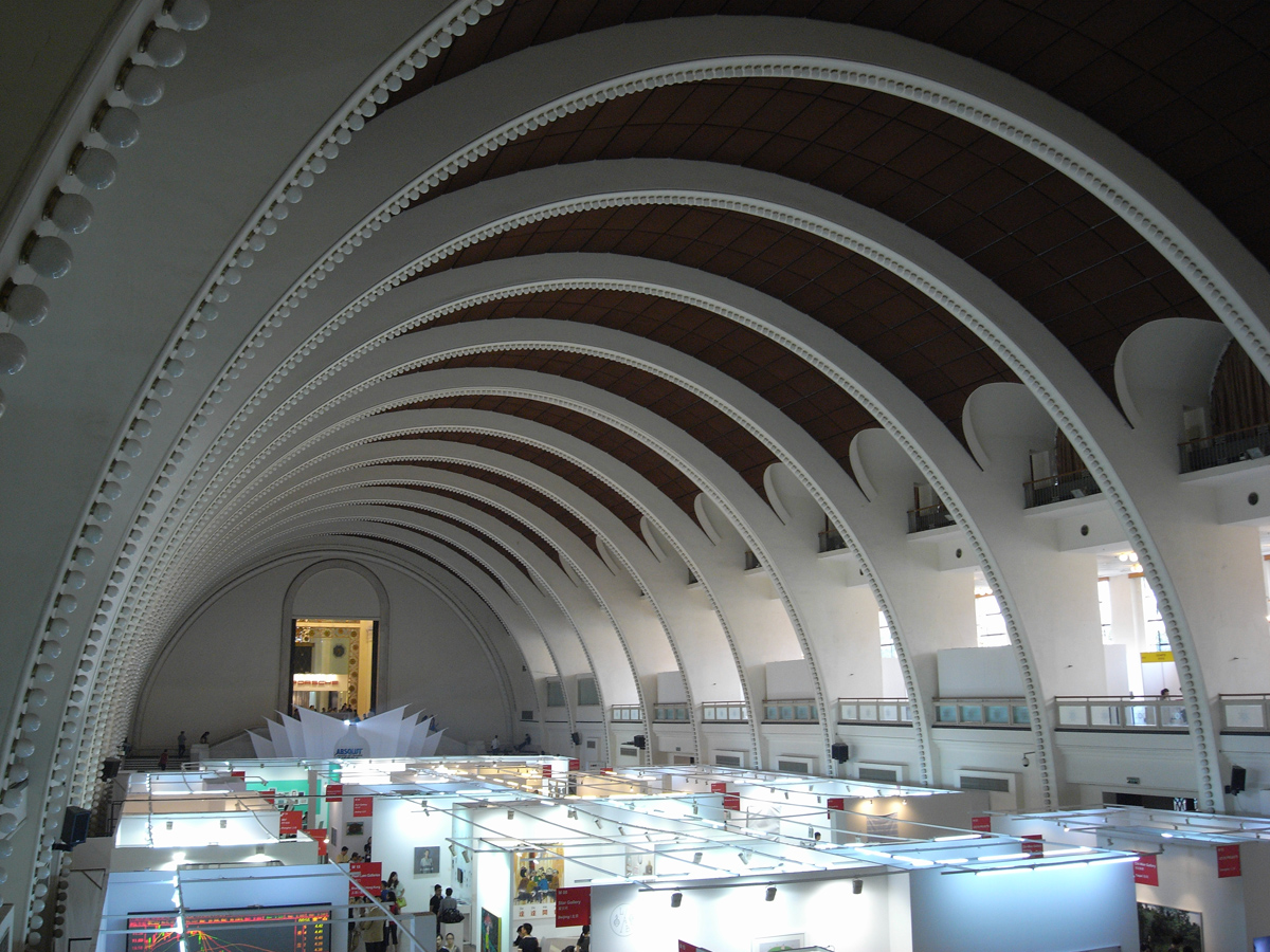
 Last but not least if you haven’t seen it before, it is worth noting the spectacular soviet-style architecture of the exhibition centre.

On the exterior, unfortunately a lack of taste was proven by the out-of-place Porsche booth which looks like a tumor on the original architecture: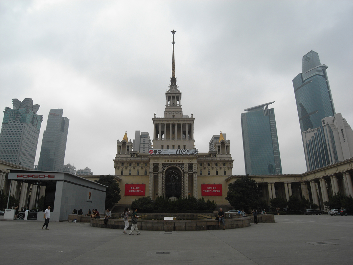
To conclude and sum up, SH Contemporary was worth a visit, but it was not over-spectacular. There were some nice works to be found. Unfortunately the low quality of the installation negatively impacted the viewing possibility of new media works, and thus worsened the overall impression.